H2Flow created a short video to show off our project! It details background information, the problem, our solution, and how it helps our customer, Duke Energy. Thank you for watching and following along on our journey!
We completed the year long process of IPPD and will take what we have learned into our experiences in the real world. Our biggest takeaways were learning how to present, working together as an interdisciplinary team, and industry exposure.
In preparation for the FDR event on Tuesday, April 25th, our team has a lot of practices scheduled. This week in class, we presented in front of our coach and our peers to receive feedback. Most of the feedback involved the videos of our dashboards being used. These were set at 2x speed and while they looked alright when planning, in practice they were too fast. The team decided that it would be better to replace these videos with screenshots so that we can decide the pace of how they are presented.
We also received feedback from our coach and peers about our project video and poster board. We received minimal feedback about our drafts and are proud of the hard work we put in up front.
H2Flow’s project presentation poster board for FDR event April 25th.
This week we are referencing, compiling, and writing like crazy for the final volumes of our design report, including a video about the project. The first volume will be an overview of all that we have done this year. The other volumes are for our direct user including the process steps we took, how to implement changes, and user manuals. We are looking forward to giving these documents to the sponsor and look back on all of our accomplishments over the year.
Another step that the team is taking to ensure the successful transfer of our project to Duke Energy is we are holding a meeting at the site where we “go live” with the data. Duke Energy’s data analyst, Marian Valach, has helped us throughout the semester and will be the one to implement their current data into our dashboards. This meeting will allow the entire team to be able to troubleshoot problems quickly and will be a great celebration for everyone who was a part of its success.
Just two weeks until our Final Design Review!! With that said, our team is putting all the final touches on our product and is shifting towards documentation for the FDR.
For this final presentation the team will:
produce a video showing their problem and solution for the customer
we will present a poster board depicting the project
Our liaisons and sponsors will receive an individual presentation of our project
lastly, we will present to a room of IPPD faculty, staff, coaches, and liaisons about the final details of work we have done this year!
We are all very proud of what we have accomplished this year and are looking forward to showing off all our hard work!
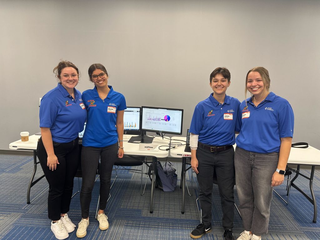
Snapshot from Final Design Review video of team H2Flow’s project presentation.
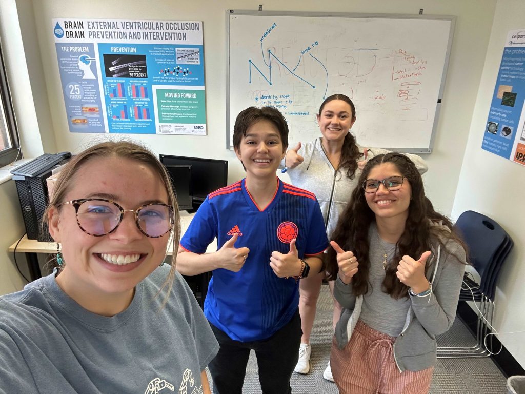
This week the team presented our nearing completion dashboard designs as well as the application to clean the chemical data. We received glowing reviews from all the people we presented to. It was very rewarding to be able to feel confident with our problem and solution as we know that it is exactly what the customer wants and is expecting. We let the reviewers test out the system themselves and try out the usability and functionality of all the features within each dashboard and the application.
We had a fun time being able to walk around and see other groups’ final project designs and how far we have all come as a cohort.
This week our team divided and conquered our work to progress closer towards tying up our loose strings. We are dedicated to provide Duke Energy with an all encompassing product before we hand it off to them to integrate into their system. The quality dashboard is nearing completion following our last iteration so our main focus is on the compatibility of the MATLAB app to clean the sensor data with the cost dashboard.
The action items that we addressed this week include:
Applying the feedback received after our last iteration regarding visuals on the quality dashboard
Building out the visuals for the cost dashboard
Developing the front end of the MATLAB application to clean data
Our team completed our third design iteration by meeting our project sponsors at the site and going through both dashboards with them. They are our main users so it is very valuable to receive their feedback and thoughts. They are a pleasure to work with and have given us lots of good information about what their current process for tracking quality and cost are so that we can try to replicate some of their process.
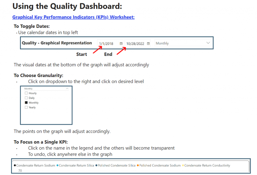
For the quality dashboard we are nearing completion and anticipate that we can close off this part of the project in our next meeting after spring break. This would allow our team to fully focus on the cost dashboard. We have also added user manuals to both dashboards as shown in the image below. This helps the customer to be capable of using our product easily regardless of their level of technical ability.
User guide/ instruction page for the quality dashboard
The cost dashboard is nearing its final stage for calculations and we are shifting to focus on building out the visuals for both the PowerBI dashboard display as well as the MATLAB application that is running the calculations. The sensors that we are collecting data from have a noise level that needed to be filtered out that was only possible through avenues besides PowerBI.
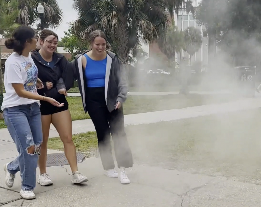
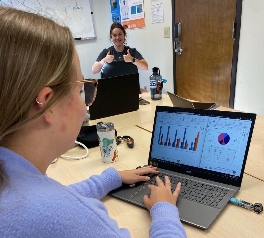
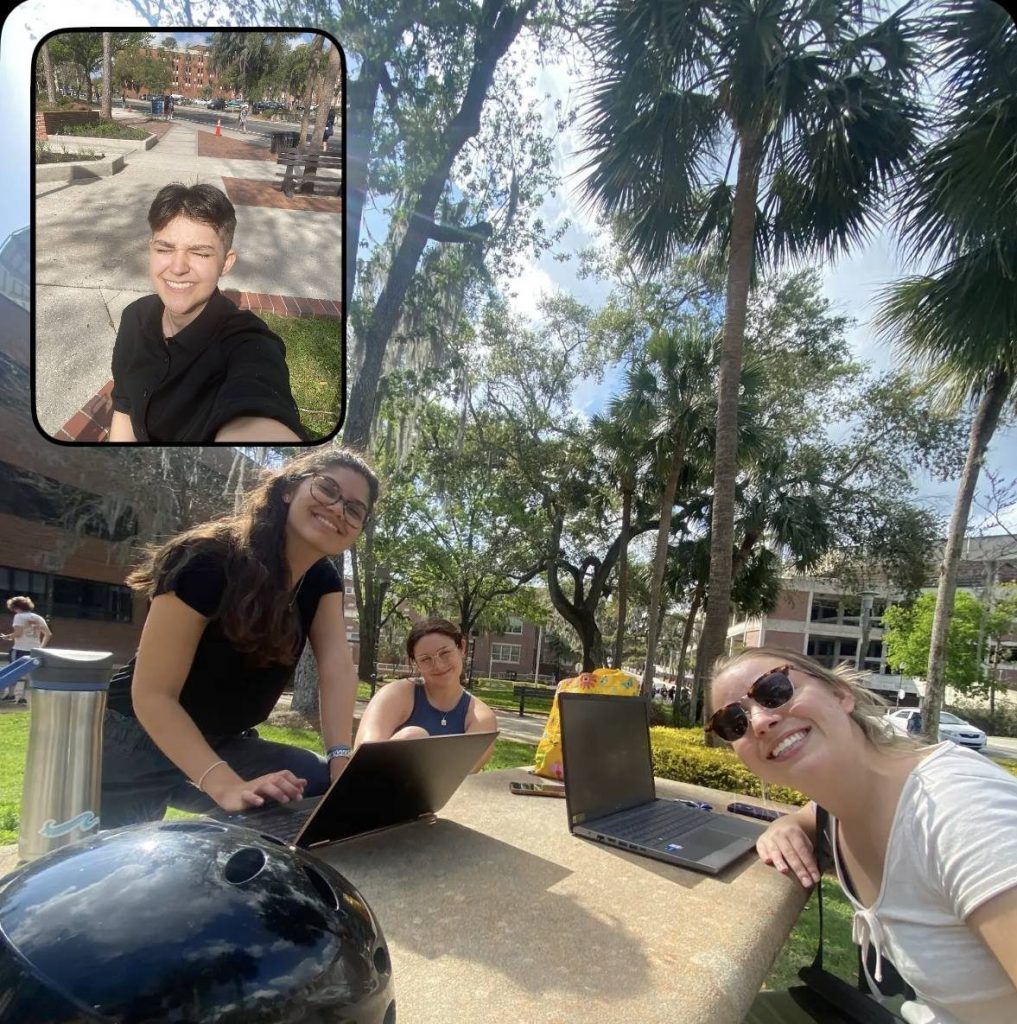
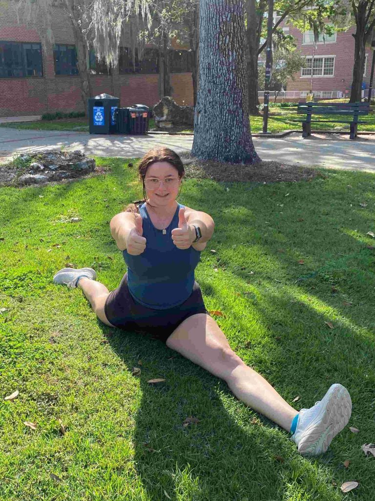
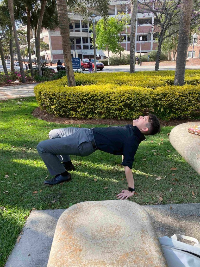
H2Flow enjoyed doing some of their weekly work together outside in the nice weather. We have enjoyed getting to bond together even more in our second semester working together.
The team has been putting in tons of work to track cost data through MATLAB, a programming language designed for engineering calculations. We have successfully implemented a method of tracking local minimums to draw out the data we need for chemical usages with minimum noise. The program has the capability to be implemented as an application for the dashboard. Next week we will go into our last iteration for both of the dashboards and will address plans to go from there.
Our liaisons often discuss with us how important it is for us to stay in check with our mental health and being able to manage work/life balance. During one of our group meetings (as shown in the image above) we took a break to stretch and enjoy the outdoors.
Kendall stretching not only her brain muscles!Julian stretching not only his brain muscles!
With both dashboards fully integrated with data and visuals, our work has focused in on ways to manipulate the cost data to show the results we need. In order to report usage and price, curve fitting, dimensioning, and filtering the chemical usage data is necessary. These calculations are being added to the PowerBI program as we go to keep the product centralized for the customer.
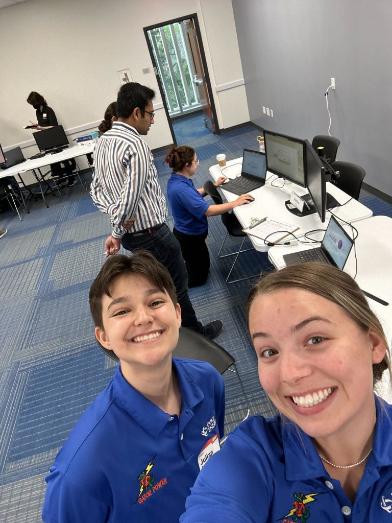
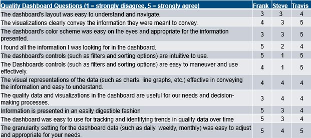
This week we met at the Duke Energy site with our liaison, Travis, our project sponsor, Frank, and the site manager, Trey. They completed our second round of iteration testing with the usability questionnaire from the first iteration. We are looking forward to comparing our results after implementing changes after the first iteration.
We had our first customer review of our quality and cost dashboards. They both are fully incorporated with the data from the site and equations for calculations were added. We have completed lots of progress in data manipulations, projection building, and graphic user interface design. The engineers and superintendents that our liaisons have all reviewed this stage of our product. We are on the path to implement all the changes they see fit. We have reviewed all feedback and have started to implement the changes; most of which have to do with usability rather than the actual data points. The questions below were asked along with a few written response for both dashboards.
This first iteration was quite successful and we are getting the hang of our workflow in PowerBI. It is a pleasure getting to work with the Duke Energy team so closely. The direct communication provides for easy and fast changes to be implemented between iterations.