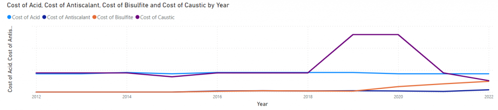
This week we are making leaps and bounds in progress on the dashboards in PowerBI. After getting over a road block with the data not aggregating properly, we were able to complete the rest of the quality dashboard. The best feedback we have received so far is that the supervisor liked the ease of functionality of the granularity parameters. He said that this formatting was much easier than their current way of sorting data. Therefore, we are going to implement the same structure into the cost dashboard.
We went to the site on Wednesday to help grant the project sponsor access to the dashboards as well as answer questions he may have. He gave us great feedback that told us we were achieving good progress as well as some actionable items to correct.