This week, we were able to start gathering data from the radar device and visualize the data on a graph. Below is a video that demonstrates how the radar picks up an object from a distance. Note that the orange dots represent a point on a object that the radar detects.
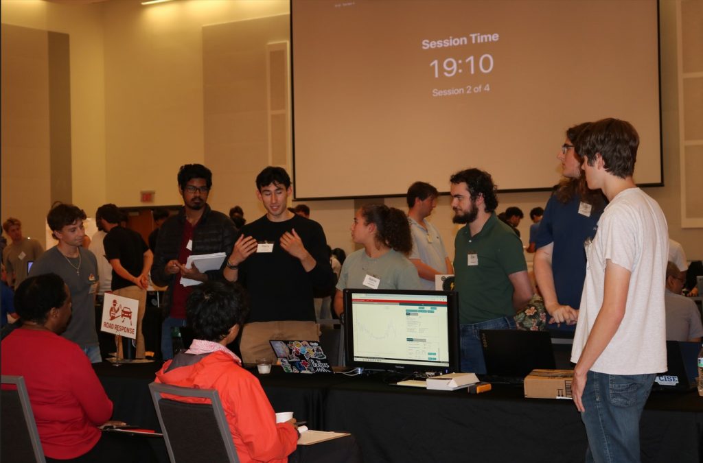
In the video above, you saw a spike with a lot of orange points and that represents a cardboard box that we move in front of the radar. We used this demonstration to provide clarity in front of eight judges whom provided feedback during prototype inspection day.
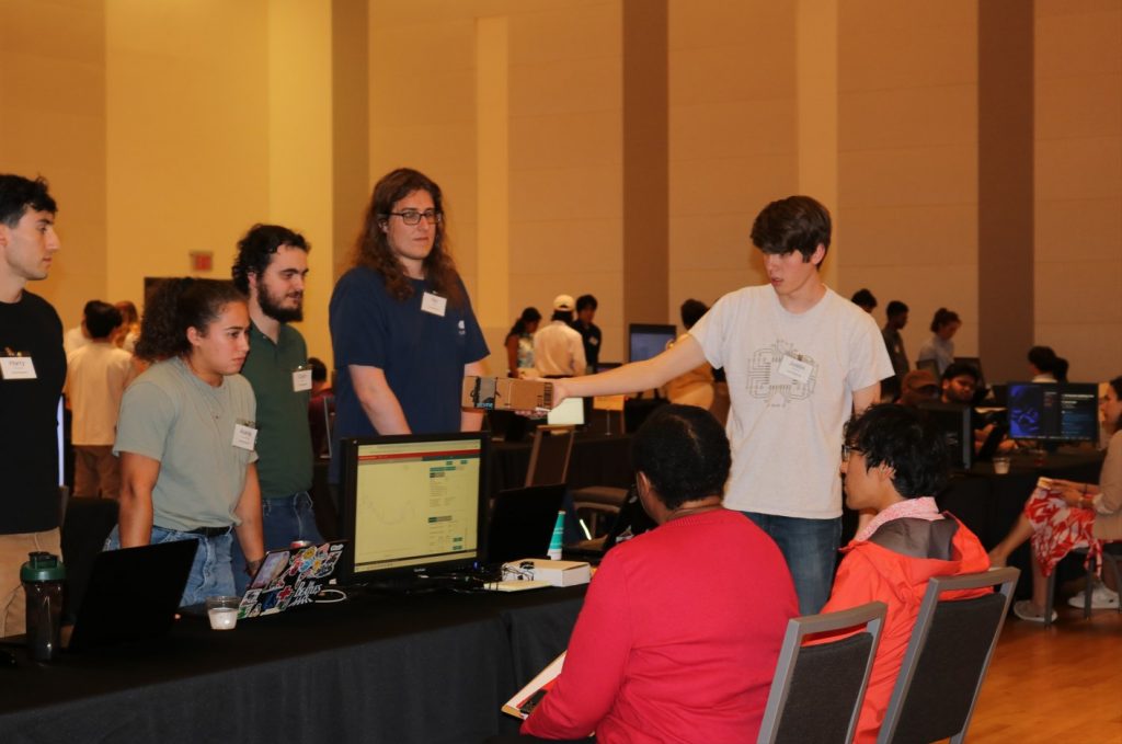
During the event, the judges pointed out that we had a lot of noise in our demonstration. So, we need to figure out a way to filter out the noise in order to detect cars accurately. Furthermore, they suggested that we should implement “fake noise” into the radar device itself to test our car detection algorithm. This would ensure better accuracy in noisy environments.
In all, this week proved to be a big step in our journey to create a device that alerts workers of traffic hazards ahead of time to save lives.